Woodinville Whiskey Co Limited Release Bourbon
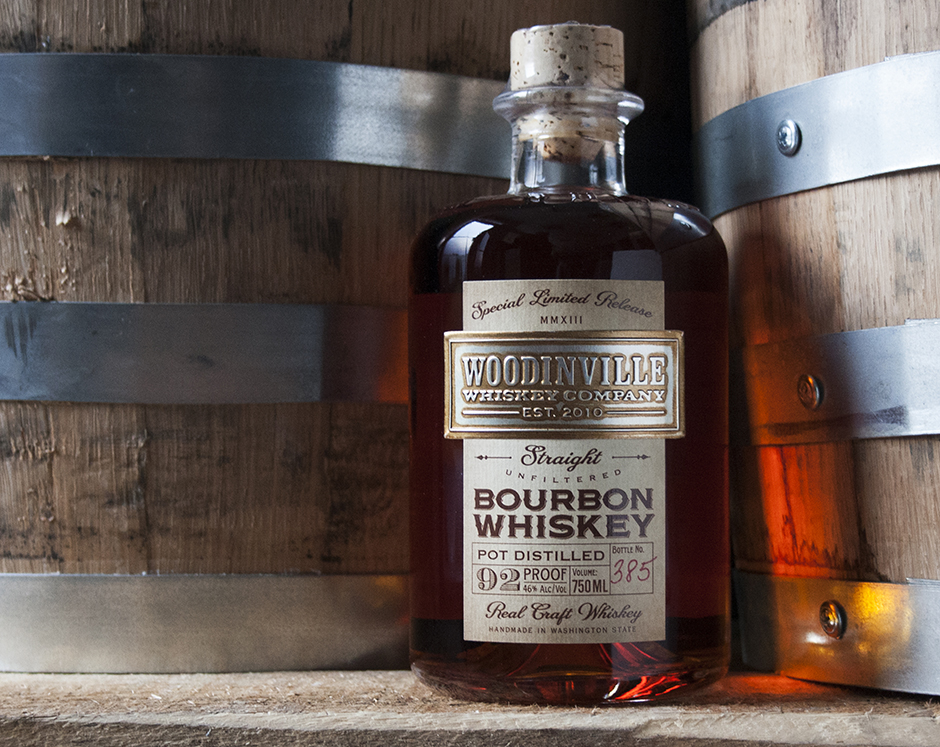
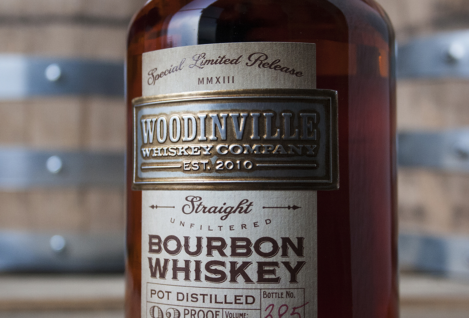
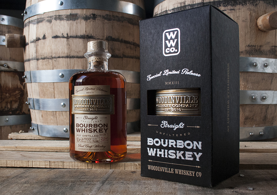
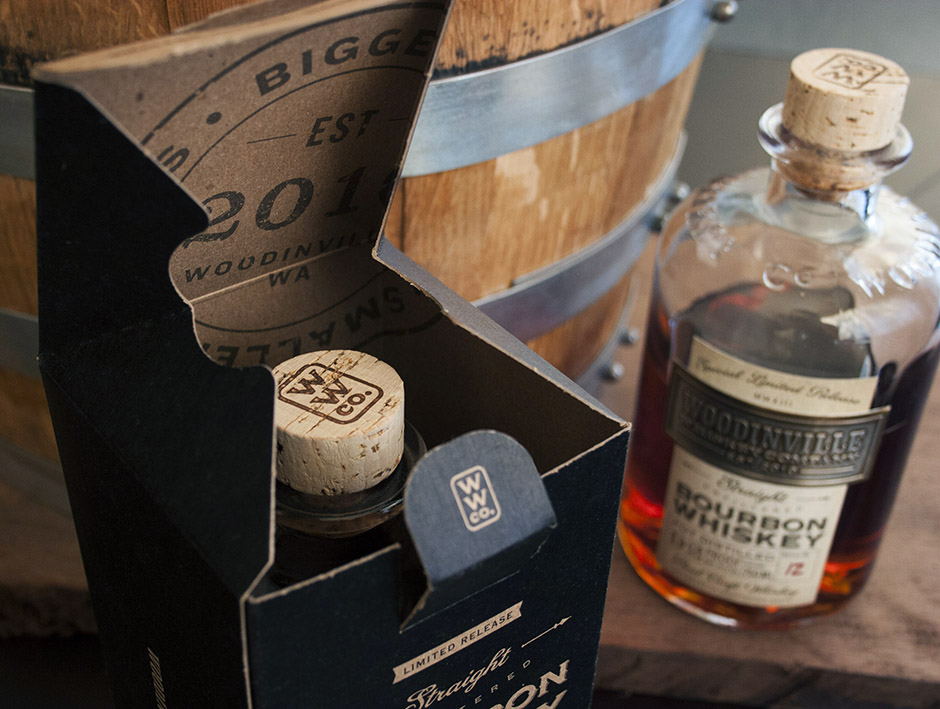
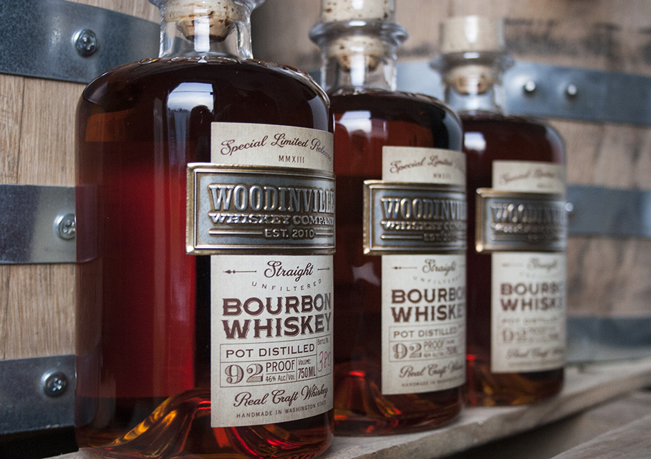
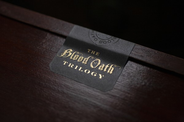
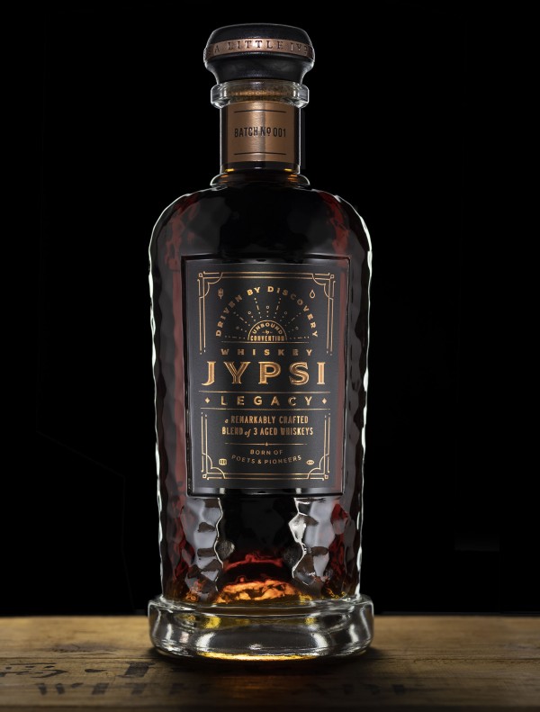
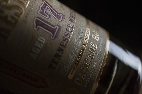
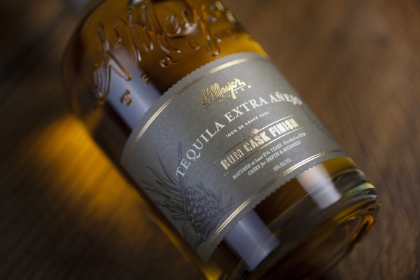
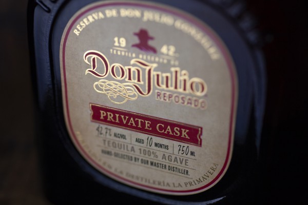
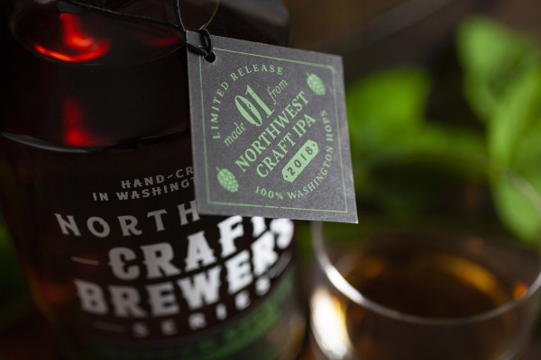
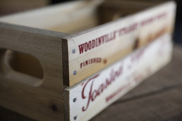
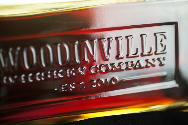
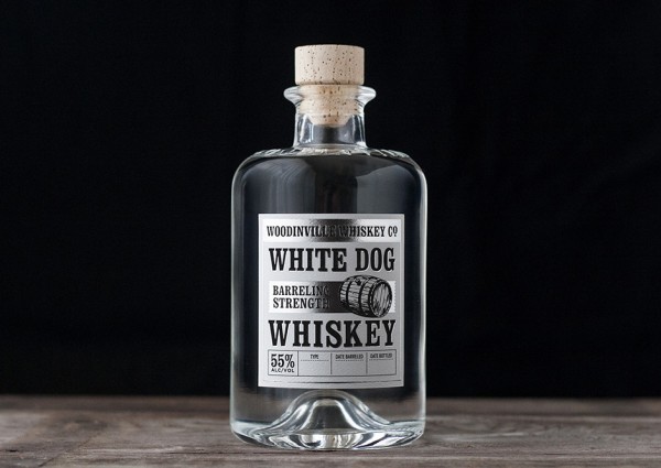
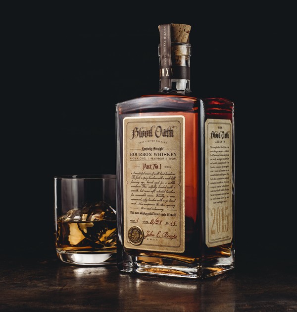
I’ve had the pleasure of working with Woodinville Whiskey Company since 2012. Each project I undertake with them is as rewarding as their products are desirable. This project included an original label and carton design for their first ever straight bourbon. It’s a special moment for a young distillery to release their first straight whiskey – it takes years of patience and there’s no shortcutting it. The stuff has to age. I was honored to be a part of this momentous product release for them.
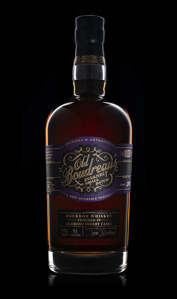
The label and carton design are intended to convey the brand’s key attributes. This is a serious, classic, American whiskey – but these guys aren’t from Kentucky. Still, there’s some common ground to be found between the rugged pioneer spirit that brought settlers to the Pacific Northwest and the well-known and proud tradition of whiskey making in Kentucky. It’s hard to articulate in a few sentences, but after a few sips and some soul searching with Owner/Distillers Orlin Sorensen and Brett Carlile, we were on the same page with where this brand is coming from – and where it’s going. In short, they are approachable, respectable, warm, traditional, scrappy, self-made, unpretentious and proud – all at the same time.
All those things had to go into this package design. And it had to relate to their existing brand/products at the same time. And yet it needed to be clear that this product is special. It’s a delicate balancing act.
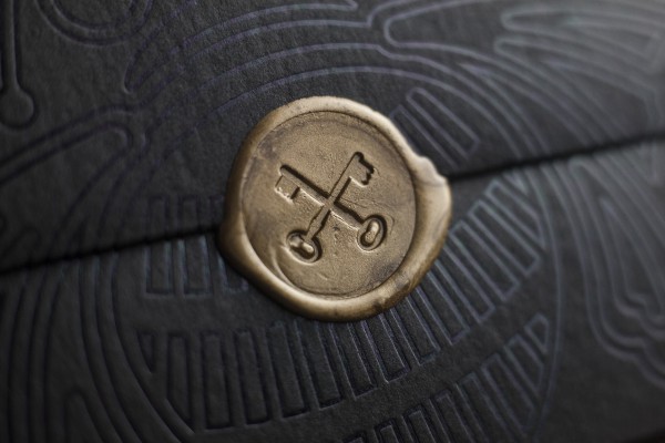
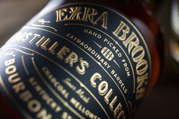
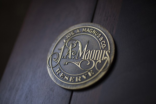
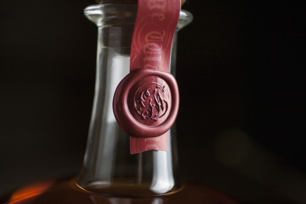
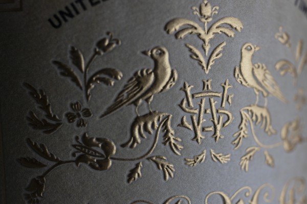
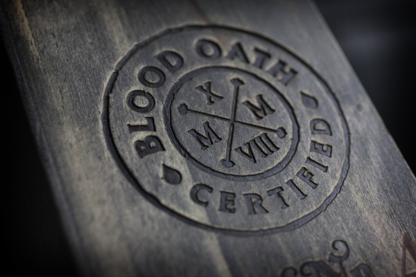
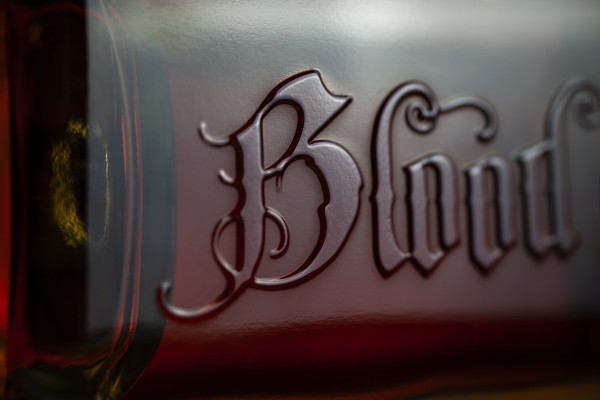
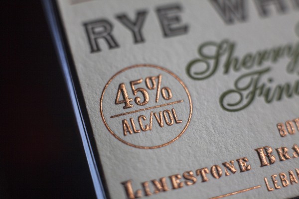
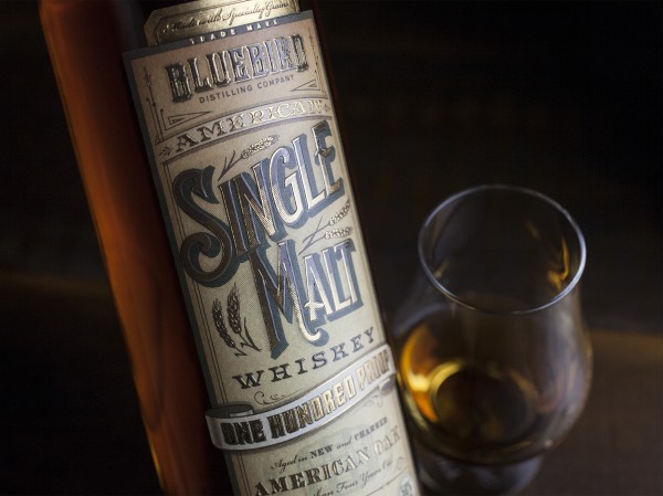
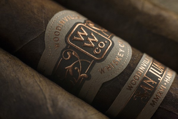
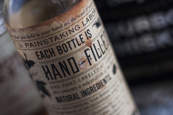
Print specifications were of utmost importance. The papers and print techniques used in this package had to convey the same authenticity and warm, rich, tactile appeal that went into the product. Every decision with regard to these details was carefully made, and more than a few sub-standard samples were scrapped in the process. This was all accomplished within a fairly tight production budget. Achieving a top-shelf result with a print run of 600 units isn’t easy. We had to get creative.
Package design and photos by David Cole Creative.
