Package Design Goes Way Beyond Labels
I’m thoroughly enjoying the multi-dimensionality of this little niche and I thought I’d share a few of this morning’s activities which perfectly exemplify what I do and why I love it so.
The hardest part of sharing this is right now is the fact that this product is still in development so I can’t show you the “after” photos or even the big-picture conceptual renderings. Those will come soon enough. For now I’ll just share some photos with quick descriptions of this morning’s most interesting developments.
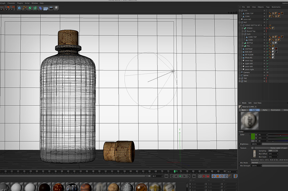
Most of my package designs involve photo realistic 3D renders. This is an invaluable aid when it comes to visualizing the real, dimensional product. It’s priceless for comparing two different ideas side by side and for viewing otherwise impossible-to-prototype features like embossed glass and metal, foil stamping, etc. In the end, the images created through this process are lifelike enough to be used in sales materials and catalogues long before real photos would be possible. I’ve created many renders for this purpose alone, many of which continue in use as sales images even after real product photos become available. Either way, photo-realistic renders give both client and designer priceless confidence when making hard decisions.
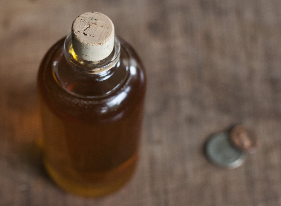
Ensuring proper container capacity is crucial. The conversion from fluid ounces (volume) and ounces (weight) varies from one product to another depending on the density. It would be disastrous to order 10,000 pieces only to find out you made a simple mathematical error. Always verify with a physical sample. In this case I’m using a precise scale to fill the sample bottle with product so we can move ahead with confidence.
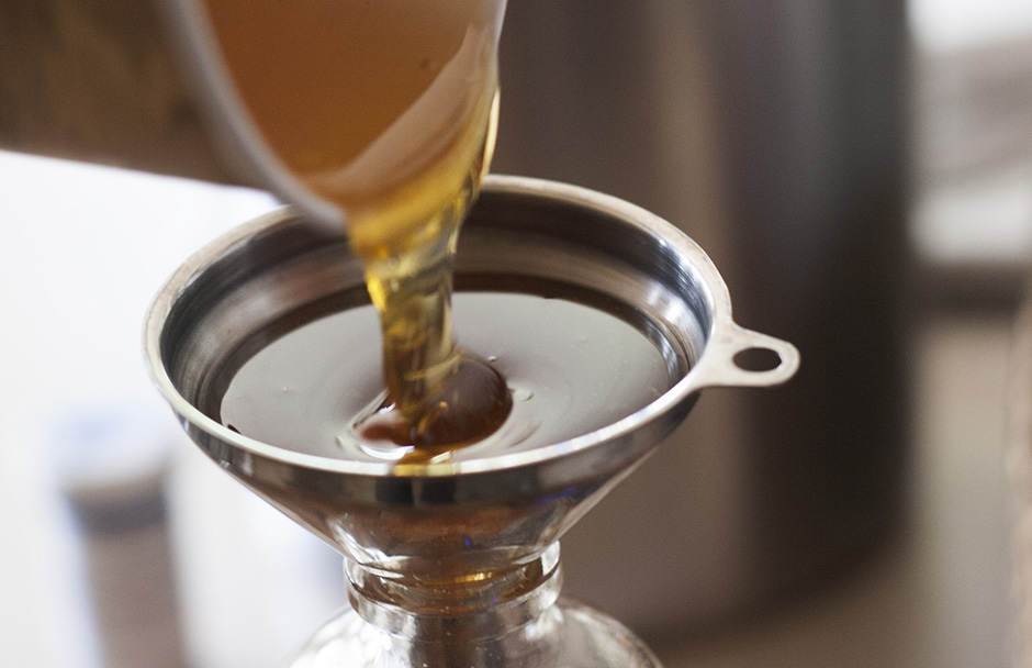
Nailed it.
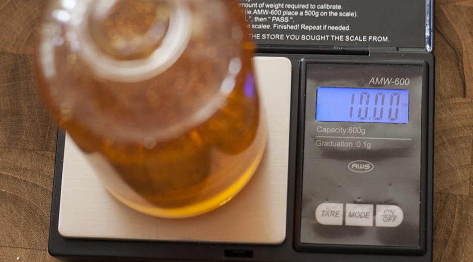
The 3D renders are very helpful when selecting a cork design, but nothing lets you sleep at night like confirming your final selection with a real-world test.
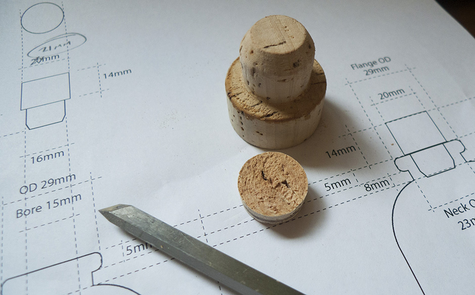
Fitting corks is an exact science. So to make sure we’re specifying a proper fit, I made a physical prototype myself. I pulled a whiskey cork from my samples stash and spun it up on the lathe. Not only did this verify the dimensions in the drawings, it revealed some unexpected and vital information about how various options feel in the hand of the consumer. I’m very glad to have taken this step and avoided what would have been an unpleasant tactile experience for the user of this product. It’s a small detail – not a deal breaker – but I believe in creating a happy experience for the consumer that goes beyond the sale. That’s part of what keeps them coming back, right?
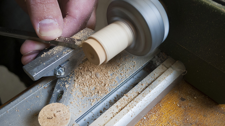
This will do nicely. Off to the factory you go.
Can’t wait to show you the whole package with artwork. Look for updates in the coming weeks – and I’ll tell you where to get some of this great stuff too.
