Digital Render VS Photograph – Woodinville White Dog Whiskey
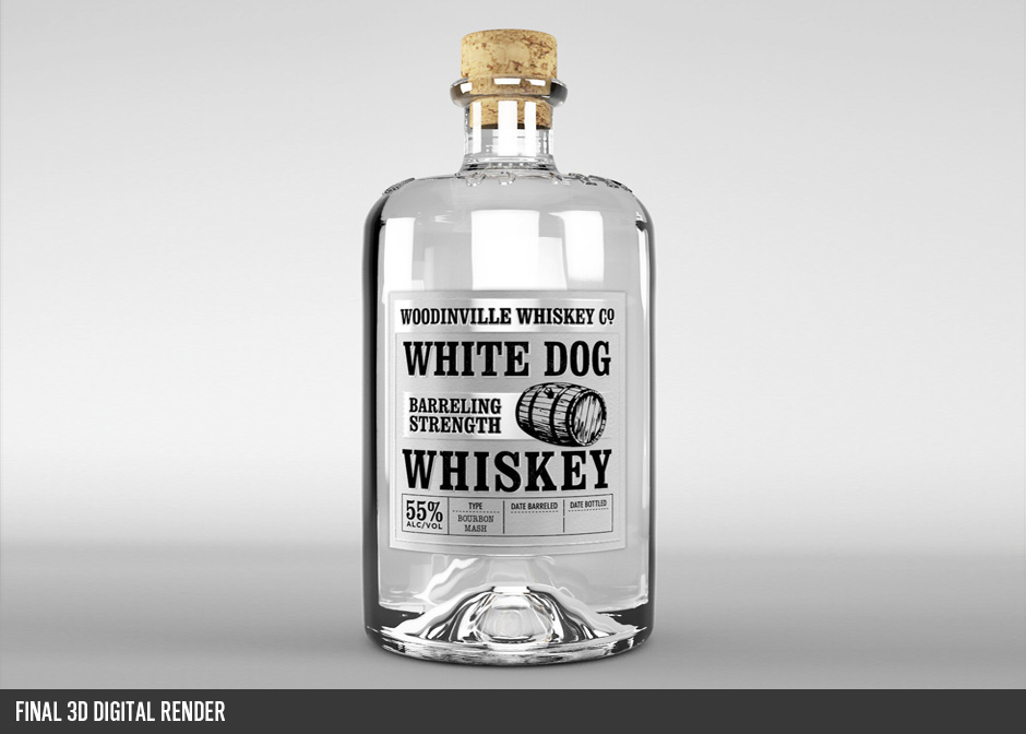
Here’s a little look behind the scenes to show you how a digital comp (3D render) is the best possible way to show design concepts for review and approval.
(If you’d rather skip the process and just take a look at more final photos of this packaging project, see the portfolio entry instead.)
After “flat” comps were reviewed and the options were narrowed down to a few likely finalists, 3D digital comps were made for further review. This allows my clients to really see what they are getting into. It’s especially useful when we’re conceptualizing new glass bottle designs. But also very helpful for visualizing processes and materials such as embossing and foils – things that are either very difficult or very expensive to simulate in a one-off physical mockup. So in that way, a 3D render can be even better than a real, physical mockup.
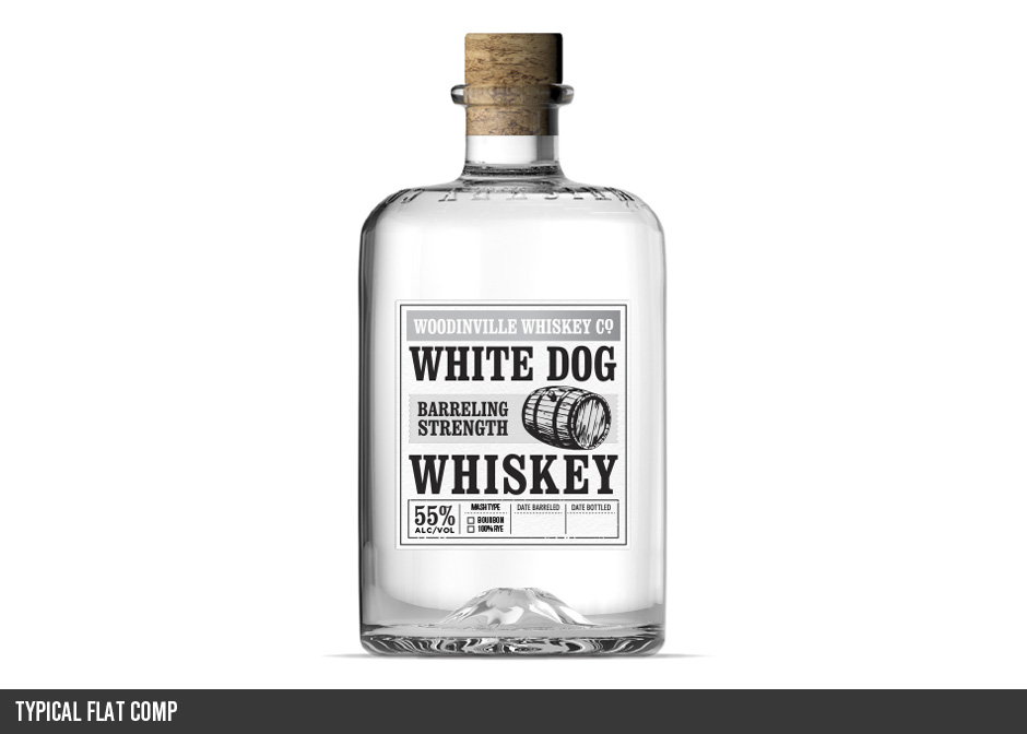
First, let’s look at a typical 2-dimensional comp created in Adobe Illustrator or Photoshop. Not bad for a preliminary look and conceptual exploration. And certainly a more efficient way of working when you’re comparing as many as ten new design ideas. At the early stages, it’s just not worth the time or investment to create a 3D model for every possible option. But it’s pretty flat indeed. And it can be quite difficult for many people to take that leap of faith from this stage, when they are about to commit the funds to print ten thousand labels. Not a bad approximation, but for my money, I’d rather look at something a little more realistic.
After a few finalists have been selected, it can be very useful to get a more accurate look at the designs in question and how they will take shape in the real world. This is a fully digital 3d render – not a photograph – created before the actual label was printed for sake of final review and approval. You can really see how the foils and embossing play in the light – much better.

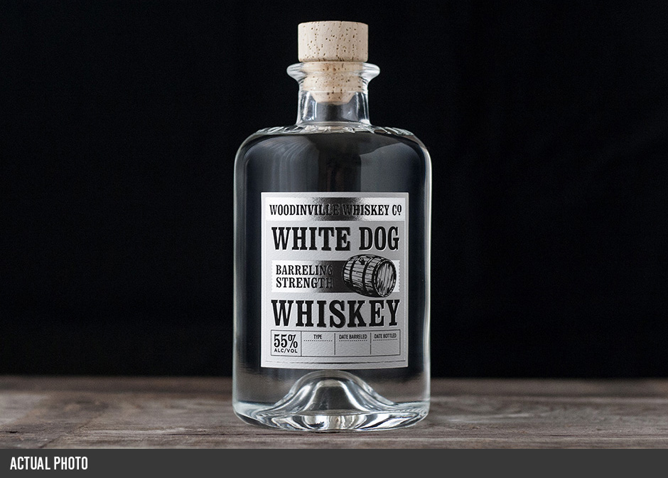
And for comparison, here’s the final, finished product, photographed:
