Everclear
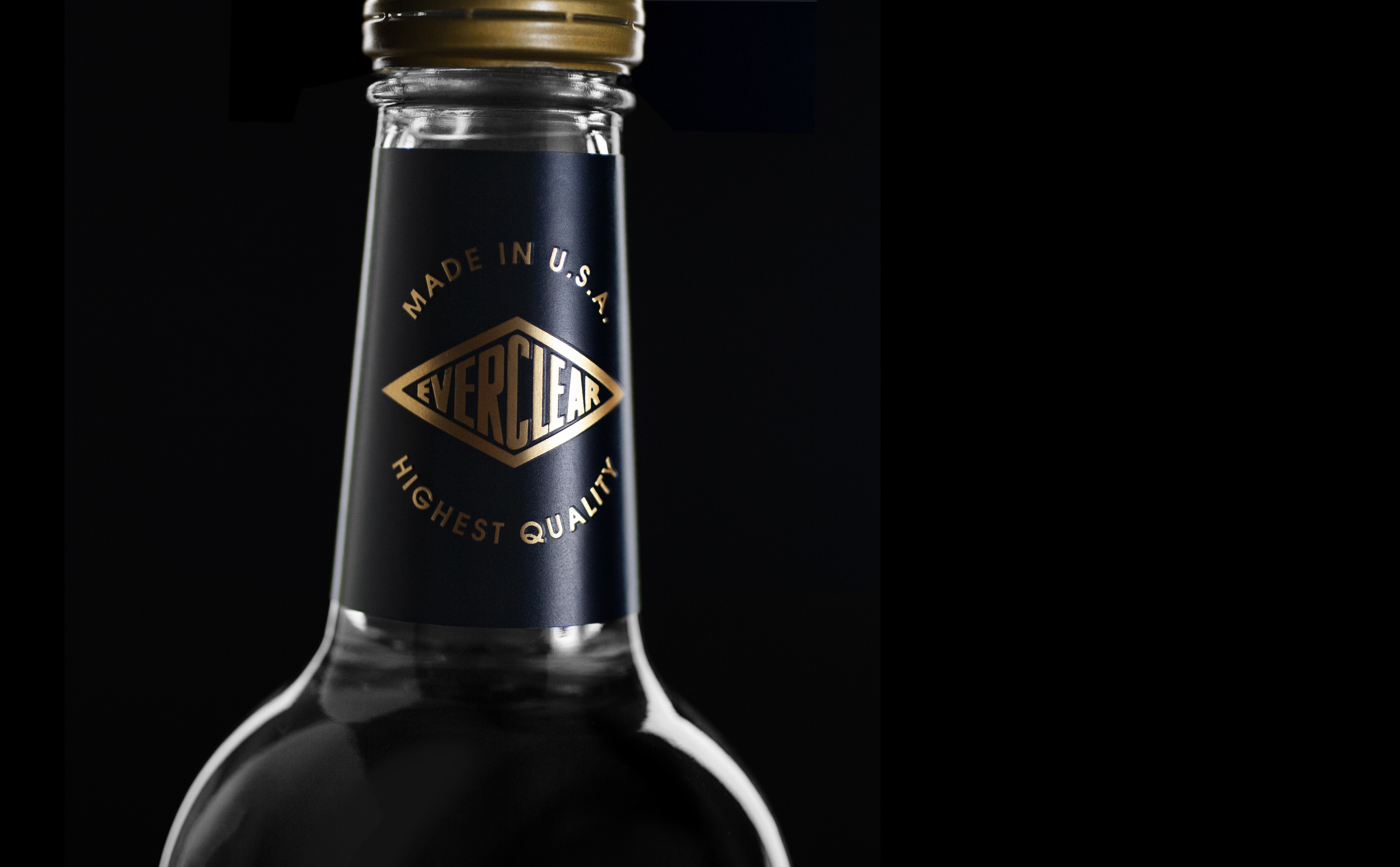
The Everclear brand and package design has remained mostly unchanged since its inception in 1950. Over the years, incremental updates have brought additional government-required language and warnings – each squeezed into a finite space, one at a time. Eventually, the decade’s accretions yielded a label which was very dense, with hard-to-read information and a virtually flat (and chaotic) hierarchy of information.
Market research showed that the package – besides looking very out of date – was doing almost nothing to educate or aid consumers in making informed an purchase decision at retail. There was little ability for consumer to read or retain any of the information on the package, and virtually none of the product’s key uses were described or promoted in any way.
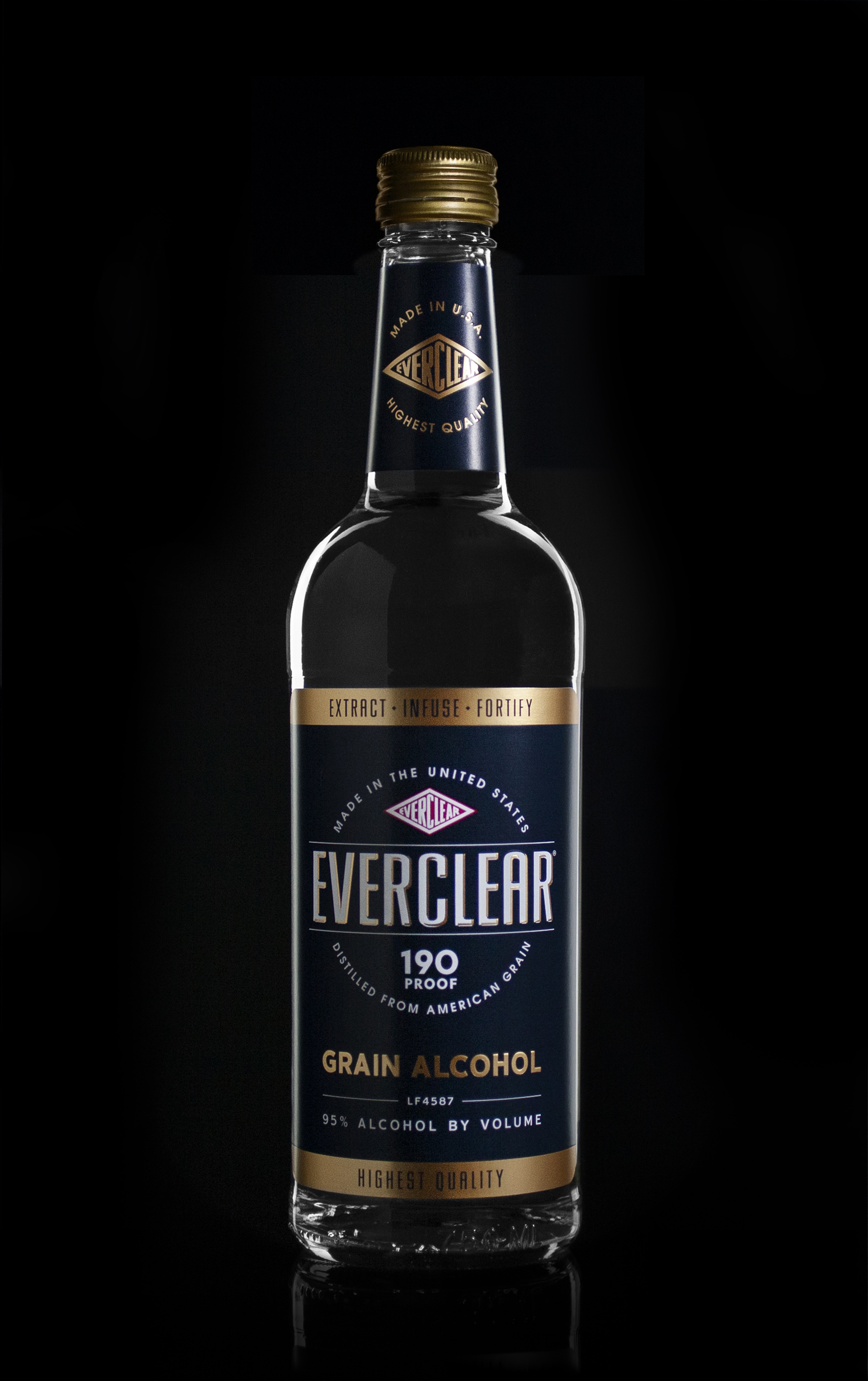
The objective was to modernize and de-clutter the package and make it work harder for the brand, create stronger recall and communicate the products key features and benefits, which primarily are 1) Everclear is the best product for making flavor extractions, tinctures, bitters, infusions, etc. 2) Everclear is a high-quality, high-purity product made in America to strict standards.
Post-launch market research validates that these objectives were met with the current redesign (shown here).
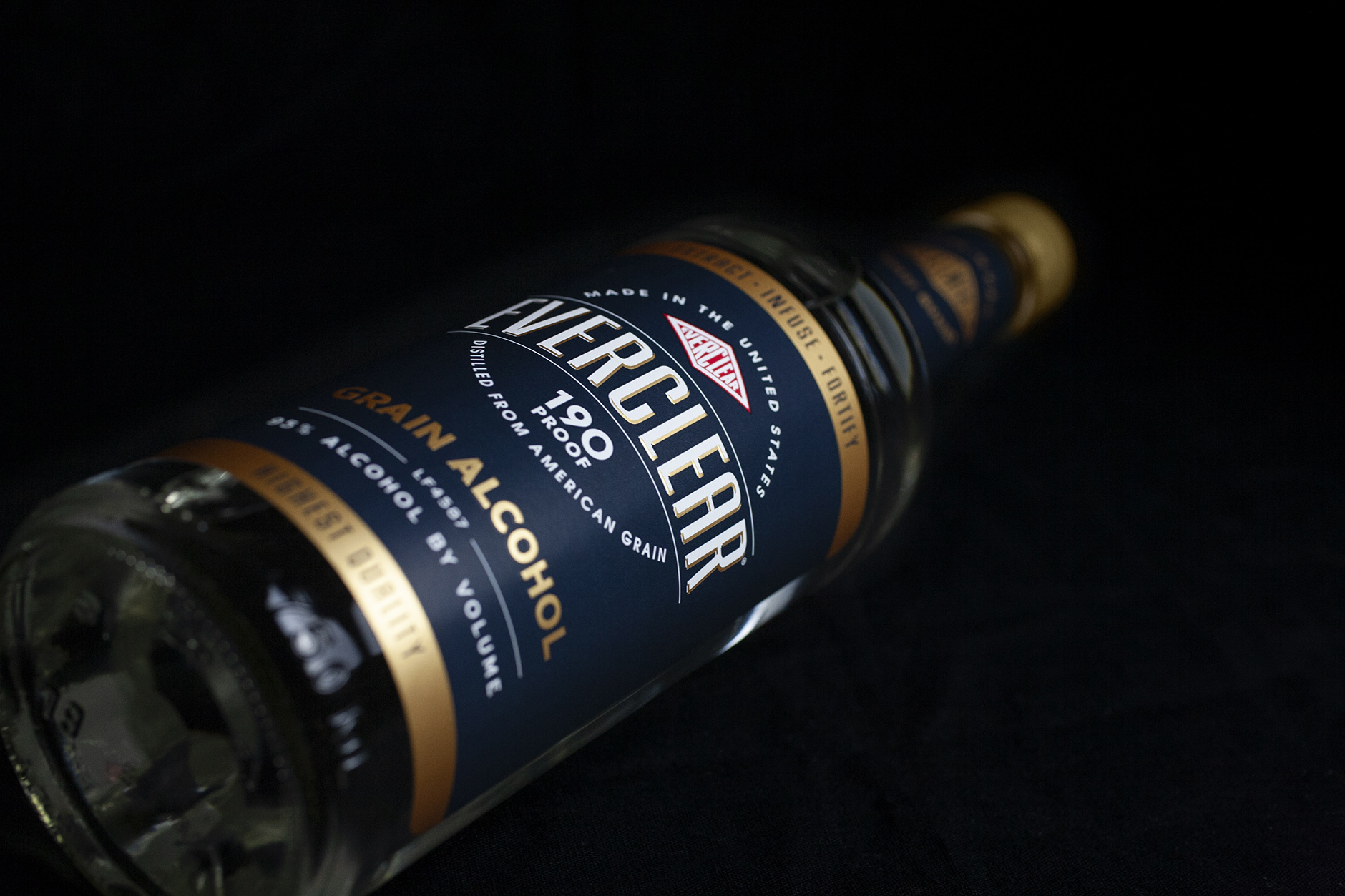
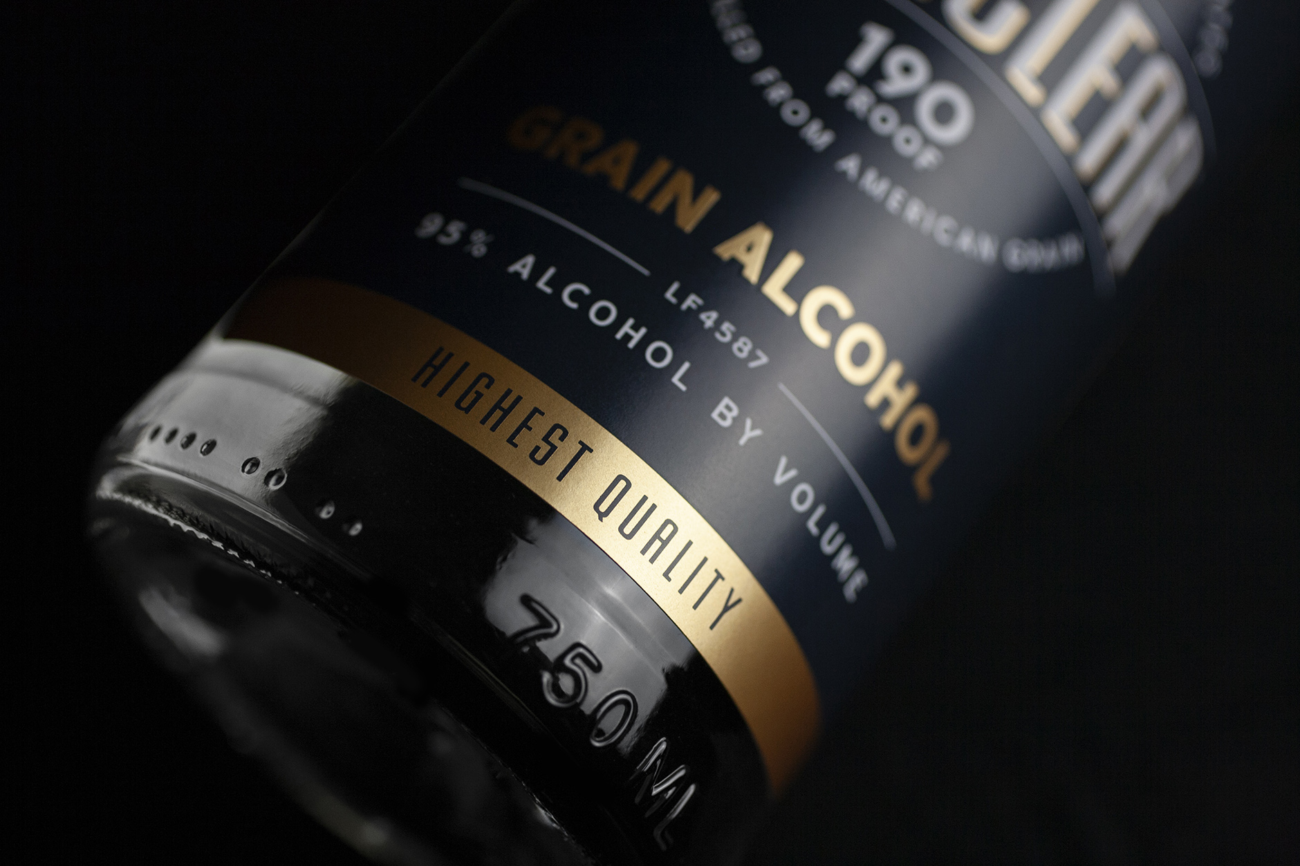
Some aspects of the legacy brand were retained for recognition and continuity: The bottle, the iconic diamond trademark, the navy blue, gold and red coloring, the placement and the use of bold, uppercase letters for the primary brand name/mark. Virtually everything else was discarded in favor of a simpler, cleaner, more-modernized appearance with a strong hierarchy of information and a clear presentation of the key messaging.
No longer a baker’s or bartender’s secret, the updated bottle now openly and deservedly takes its place on the modern mixologist’s shelf among other high-quality ingredients used with pride in the making of bitters, infusions, liqueurs and craft cocktails.
